How to Improve Website Conversion Rates That Drive Sales
Discover how to improve website conversion rates with proven strategies from industry experts. Transform visitors into customers today!
Why Your Website Visitors Leave Without Buying

It’s one of the most frustrating things for any online business: you check your analytics, see plenty of traffic, but the sales numbers just aren’t keeping up. Visitors land on your site, click around for a bit, and then vanish. This gap between traffic and actual transactions is where your profits are slipping away, and figuring out the "why" is the first real step to fixing it.
People don’t just leave for no reason. They're usually reacting to something on your site that creates confusion, doubt, or simple annoyance. It might be an unclear value proposition-they land on your homepage and can't immediately tell what you do or why it matters. Or perhaps it's a clunky navigation menu that feels more like a maze than a clear path. These are the silent conversion killers that steadily chip away at a user's confidence and patience.
The Problem With Relying on Benchmarks
When sales are down, it's tempting to look at industry benchmarks to see how you stack up. While they can give you a general idea, leaning on them too heavily can be a real trap. Conversion rates are all over the place depending on the industry, the device someone is using, and even their location. You might find more helpful industry conversion statistics on Statista.com to get a more granular view.
To give you some context, it's useful to see how much conversion rates can differ. The table below shows some average benchmarks to help you set more realistic goals for your own site.
Conversion Rate Benchmarks by Industry and Device Type
Comparison of average conversion rates across different industries and device types to help you set realistic goals
| Industry | Desktop Conversion Rate | Mobile Conversion Rate | Average Cart Abandonment |
|---|---|---|---|
| Fashion & Apparel | 2.4% | 1.9% | 74% |
| Beauty & Skincare | 3.0% | 2.5% | 70% |
| Food & Beverage | 3.1% | 2.8% | 68% |
| Electronics | 2.1% | 1.6% | 72% |
| Home & Garden | 2.3% | 1.8% | 73% |
As you can see, comparing your boutique skincare shop to a broad e-commerce average might give you a false sense of security or cause unnecessary panic. The key takeaway here is that context is everything.
Uncovering the Real Reasons for Abandonment
Instead of getting bogged down in averages, it’s far more productive to investigate what’s happening on your own site. A huge culprit is cart abandonment, which plagues over 70% of online shopping sessions globally. In the United States, one of the top reasons people ditch their carts is unexpected costs, like high shipping fees or taxes that suddenly appear at the final step. It’s a classic case of breaking trust right at the finish line.
To figure out what’s tripping up your visitors, you need to do a little detective work-a conversion audit of sorts. You don't need to hire expensive consultants to get started. Just ask yourself these critical questions:
- Clarity: Can a first-time visitor understand what you sell and why it’s great within five seconds of landing on your site?
- Trust: Do you have visible trust signals? Think customer reviews, security badges, and a clear, easy-to-find return policy.
- Friction: Is your checkout process unnecessarily long? Are you forcing people to create an account just to make a purchase?
- Mobile Experience: How does your site look and feel on a phone? Is it a seamless experience or a frustrating pinch-and-zoom nightmare?
Answering these questions honestly will shine a light on the hidden roadblocks in your customer’s path. By finding and removing these friction points, you stop pushing visitors away and start guiding them smoothly toward the "buy" button, turning curious browsers into happy customers.
Speed Kills Conversions Faster Than Bad Design

We often get caught up in tweaking designs, perfecting copy, and crafting irresistible offers. But one of the biggest conversion killers works quietly in the background: your website’s loading speed. A slow site doesn’t just frustrate visitors; it actively costs you sales. In the few seconds it takes for your page to load, a potential customer with their credit card at the ready can lose patience, get distracted, and click away forever. This isn't a small problem-it's a silent drain on your revenue.
The link between speed and sales isn't just a hunch; it's backed by solid data. Recent research shows a direct connection between how fast a site loads and its ability to convert. To put it in perspective, websites that load in one second can see conversion rates up to 2.5 times higher than sites that take five seconds. The drop-off is sharp; a one-second load time can convert up to five times better than a site taking ten seconds. While things are getting better, with 86% of pages now loading in under five seconds, there's still a huge chance for businesses to get ahead by focusing on speed. You can learn more about how speed impacts sales in this detailed breakdown.
This means that improving performance isn't just a job for your developer. It’s a core marketing strategy for anyone serious about improving their website's conversion rates.
Pinpointing Your Speed Bottlenecks
Before you can fix the problem, you need to understand where it's coming from. Guesswork won't get you far. You need to diagnose your site’s performance with actual data. Luckily, there are some great free tools that make this process easy.
A fantastic starting point is Google's PageSpeed Insights. This tool analyzes your website's performance on both mobile and desktop devices, giving you a score and a detailed report.
The report breaks down important metrics and, most helpfully, gives you a list of "Opportunities." These are specific, actionable recommendations to make your site faster, like "Properly size images" or "Eliminate render-blocking resources." Think of this report as your performance improvement roadmap.
Practical Steps for a Faster Website
Once you have your report, you can start making targeted improvements. You don't need to be a coding genius to tackle some of the most common issues that slow down websites. Here are a few high-impact areas to focus on:
Image Optimization: Large, uncompressed images are often the main culprits. Those beautiful, high-resolution photos might look great, but they could be killing your conversions.
- Compress Your Images: Use tools like TinyPNG or ImageOptim to significantly reduce file sizes without a noticeable drop in visual quality.
- Use Next-Gen Formats: Serve images in modern formats like WebP, which provide better compression than older formats like JPEG and PNG.
- Implement Lazy Loading: This clever technique stops off-screen images from loading until the user actually scrolls down to them, which makes the initial page load much quicker.
Server and Hosting: Your website’s foundation is critical. A cheap, slow hosting plan can sabotage all your other optimization efforts.
- Consider a CDN: A Content Delivery Network (CDN) stores copies of your site in different locations around the world. When a visitor arrives, content is delivered from a server that's physically closer to them, which dramatically reduces loading time.
- Enable Browser Caching: Caching lets a visitor's browser save parts of your site. On future visits, the page loads much faster because their browser doesn't have to download everything all over again.
By methodically finding and fixing these speed issues, you are directly removing one of the biggest barriers to conversion. A faster site leads to a smoother, more pleasant user experience, keeping people engaged and guiding them effortlessly toward becoming customers.
Channel Your Traffic Sources for Maximum Conversions
Making endless tweaks to your landing page without considering who is visiting is a common trap. The reality is, how you improve conversions often has less to do with the page itself and more to do with your visitors' journey. Not all website traffic is the same. Someone clicking through from a trusted email newsletter is in a completely different frame of mind than someone who just scrolled past your ad on social media. Recognizing this difference is key to smarter optimization.
Think of your website as a destination. People arriving via different paths-organic search, paid ads, email, social media-bring unique expectations and levels of interest. Your goal is to create a tailored experience that speaks to their specific journey, rather than a generic, one-size-fits-all page.
Aligning Your Page With Visitor Intent
First things first, you need to figure out where your best visitors are coming from. Jump into your analytics and segment your conversions by traffic source. It won't take long to see that some channels consistently bring in more valuable customers than others. This isn't just luck; it's a direct reflection of user intent.
For example, traffic source has a huge impact on e-commerce conversion rates. While the global average sits between 2% and 4%, this number changes dramatically depending on where the traffic came from. Email marketing is a powerhouse, boasting an average conversion rate of 5.9%. That’s a big jump from organic search at 3.6%. Paid search ads convert at about 2.5%, while social media often trails behind at just 1.8%. These figures make it clear why building a solid email list is such a valuable strategy. You can find more details in these e-commerce conversion findings on networksolutions.com.
When you direct traffic from different platforms, concentrating on those with high purchase intent can seriously boost your sales. For instance, digging into proven Pinterest for ecommerce strategies helps you connect with users who are already in a shopping mindset.
To help you visualize this, here’s a quick breakdown of how different traffic sources typically perform and where you might want to focus your efforts.
Conversion Rates by Traffic Source
Performance comparison of different traffic channels and their average conversion rates
| Traffic Source | Average Conversion Rate | Relative Performance | Optimization Priority |
|---|---|---|---|
| Email Marketing | 5.9% | Very High | High |
| Organic Search | 3.6% | High | High |
| Paid Search | 2.5% | Medium | Medium |
| Social Media | 1.8% | Low | Low |
The data in the table speaks for itself. Email and organic search are clear winners, bringing in visitors who are more likely to convert. This doesn't mean you should ignore other channels, but it does tell you where to prioritize your optimization work for the biggest impact.
Customizing the Experience for Each Channel
Once you’ve identified your top-performing channels, it's time to build custom experiences for them. It’s a bad idea to send someone from a highly visual platform like Instagram to a landing page that's just a wall of text. Instead, create a dedicated page that matches the look, feel, and tone of the source.
Here’s how you can approach optimization for a few key channels:
- Email Traffic: These visitors are already part of your circle. They know your brand and trust you. You can usually send them directly to a product page or a special offer. Using their name or referencing a past purchase makes the experience feel personal and exclusive.
- Organic Search Traffic: People coming from search engines have a specific question or problem. Your landing page must provide the answer immediately. Use clear headlines and content that directly address the search query that brought them to your site.
- Paid Ad Traffic: Consistency is everything here. The headline, offer, and visuals on your landing page must be a perfect match for the ad they clicked. Any mismatch creates confusion and will send them bouncing right off your page.
This infographic shows just how powerful a targeted approach can be. After optimizing a landing page for specific traffic, the improvements were significant across the board.
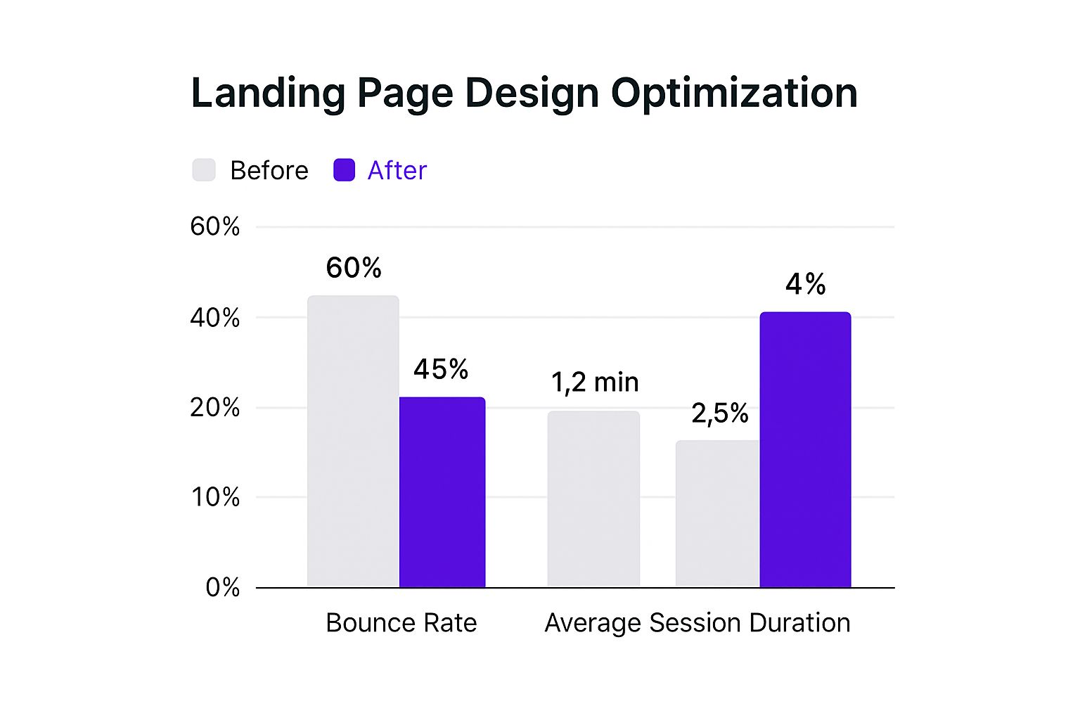
As you can see, creating a more targeted landing page experience doesn't just lift your conversion rate. It also boosts overall engagement by keeping visitors on your site longer, which is a win-win.
Design Psychology That Actually Converts Visitors
Your website's design is much more than just a slick color palette and modern fonts. It’s a powerful tool that guides visitors, sets their expectations, and can either build immediate trust or plant seeds of doubt. Every single element, from the page layout to the color of your "Add to Cart" button, triggers a subtle psychological response. Getting a handle on these triggers is key if you want to improve your website conversion rates because it lets you build an experience that nudges people toward taking action.
Think of it as reducing mental friction. When someone lands on your page, their brain is subconsciously firing off questions: "Can I trust this place?" "Is this worth my time?" "Okay, what do I do next?" A well-designed site answers these questions quickly and with confidence.
Building Instant Trust and Credibility
Before anyone even thinks about buying from you, they have to trust you. A professional, clean design is your opening handshake, but certain elements can seriously ramp up your credibility.
- Social Proof: We're social creatures, hardwired to follow the crowd. When we see that other people have had a good experience, our own hesitation starts to melt away. Testimonials and reviews are the classic go-to for social proof, and studies show they can boost conversion rates by as much as 34% when done right. Don't just toss a random quote on the page. Use real photos of your customers, link to their social media profiles (with their permission, of course), and show off detailed case studies that back up your claims.
- Trust Badges & Security Seals: These are non-negotiable, especially on checkout pages. Displaying logos for payment options like Visa or PayPal and security certificates (like SSL) is a visual shorthand that tells customers their financial details are safe. It’s a small touch that can be the difference between a completed purchase and an abandoned cart.
Using Color and Layout to Guide Action
Color isn't just for branding; it's a vital part of directing user behavior. The psychology of color tells us that different hues bring out different emotions. For example, blue often signals trust and security, which is why you see it all over banking and finance websites. Red can create a feeling of urgency, making it a popular choice for "Buy Now" buttons or limited-time offers.
The most important rule here, though, is contrast. Your call-to-action (CTA) button needs to jump off the page. If your site has a mostly blue theme, a bright orange or yellow CTA will immediately draw the eye to the most important action you want someone to take.
Visual hierarchy is another crucial concept. You can guide a visitor's gaze by using size, color, and placement to signal what's most important. Your value proposition and CTA should be the most visually dominant elements on the page. People often scan websites in an F-shaped or Z-shaped pattern, so placing key elements along these natural eye paths can increase the chances they'll be seen and clicked.
Creating Urgency and Scarcity
The fear of missing out (FOMO) is a serious motivator. When people think an opportunity is limited, they are far more likely to act quickly to avoid feeling regret later. You can weave this into your design in a few smart ways:
| Tactic | Example Implementation | Psychological Principle |
|---|---|---|
| Scarcity | "Only 3 left in stock!" | People tend to place a higher value on things that are rare. |
| Urgency | "Sale ends in 24 hours" (with a countdown timer) | A deadline forces a decision and prevents people from putting it off. |
| Social Urgency | "25 people are viewing this item right now" | This combines FOMO with social proof, suggesting high demand. |
A word of caution: these tactics must be genuine. If customers figure out you're faking scarcity or urgency, you'll shatter their trust. But when used honestly, they can give a hesitant buyer the final push they need. Ultimately, every design choice should serve your conversion goal, from a well-placed chatbot that answers last-minute questions, as detailed in this helpful guide on AI chatbots, to the exact shade of your "Confirm Purchase" button.
Testing What Really Moves The Conversion Needle
It's easy to get lost in the weeds of conversion optimization. I've seen teams spend weeks debating button colors while completely missing the bigger picture. The real secret to boosting conversions isn't just about testing; it's about testing the right things first. A systematic approach that goes after high-impact elements will get you results much faster than making random, small tweaks.
Think of it like renovating a house. You wouldn’t waste time picking out new doorknobs if the foundation was cracked. The same logic applies to your website. The most significant wins often come from changes to your core value proposition, the main headline, the page layout, or the offer itself. These are the foundational pieces that sway a visitor's decision to stick around and convert. While changing a button's color might give you a tiny lift, a complete overhaul of a confusing headline can deliver double-digit growth.
Identifying Your High-Impact Testing Opportunities
So, how do you find these "cracked foundation" areas on your website? It’s a mix of digging into data and trying to understand your users. Start by diving into your analytics to find pages that get plenty of traffic but have disappointing conversion rates. These are your prime candidates for a makeover. Once you've picked a page, use tools like heatmaps or session recordings to see where people are getting stuck or leaving.
With this information, you can build a solid testing plan. Focus your hypotheses on bold changes that tackle the core issues you've uncovered. Here are a few ideas for high-impact tests to get you started:
- Headline Variations: Don't just change a word or two. Test a completely different angle for your main headline. Try focusing on benefits instead of features, or write one that creates a sense of urgency.
- Offer Restructuring: Instead of just tweaking the price, test a different offer entirely. Could you bundle products, offer a free trial, or throw in a valuable bonus that sweetens the deal?
- Layout Overhauls: Experiment with a totally new page layout. Perhaps your call-to-action is buried below the fold, or your customer testimonials aren't visible enough.
- Media Changes: Pit a compelling product video against your current static hero image. The right visual can often communicate value much more effectively than paragraphs of text.
From Hypothesis to Actionable Insights
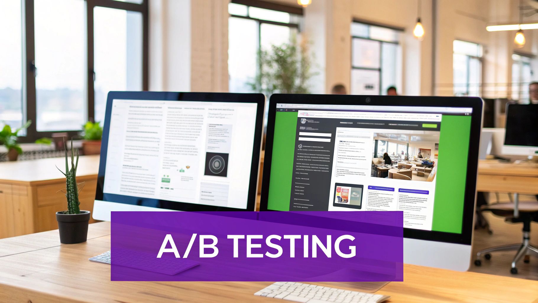
Once you have a strong hypothesis, it's time to run an A/B test, which you might also hear called a split test. This process involves showing two different versions of a page to separate segments of your audience at the same time to see which one performs better.
Popular testing platforms like VWO make this process straightforward. The key is to follow a structured approach: you begin with a hypothesis, create a variation based on it, and let the software handle the traffic splitting and data gathering. This takes the guesswork out of the equation.
Now comes the hard part: patience. You must let the test run long enough to achieve statistical significance. This is a fancy way of saying you need to be confident the results aren't just a fluke. Don't be tempted to stop a test early just because one version seems to be winning. A good testing tool will let you know when you've collected enough data to make a reliable call.
Once a clear winner is declared, implement the change for all your visitors and move on to your next high-impact test. This cycle of prioritizing, testing, and implementing is the engine that drives real, sustained growth in your conversion rates.
Advanced Tactics That Scale Your Conversion Success
Once you have your core pages optimized, it's time to dig into strategies that can really multiply your success. This is where we shift from a one-size-fits-all website to an experience that feels custom-built for each visitor. These advanced tactics don't mean you need a massive technical team, but they do require a sharper focus on your user's journey.
The idea is to transform your site from something static-the same for everyone-to a dynamic environment that adapts in real time. This means going beyond simple A/B testing and embracing personalization and smart automation.
Unlock Deeper Insights with Behavioral Analytics
Your standard analytics are great for telling you what happened, but to truly boost conversions, you need to understand why. This is where behavioral analytics tools are a game-changer, giving you a front-row seat to your users' actual experiences. Tools that provide heatmaps and session recordings let you see precisely where people click, how far down the page they scroll, and, most importantly, where they get stuck.
For instance, take a look at a popular tool like Hotjar, which provides a whole suite of features to help you visualize what your users are doing.
This kind of visual dashboard quickly shows you where users are engaging, helping you spot patterns that raw data alone would never reveal. I've seen heatmaps show that dozens of users were trying to click on a non-clickable image. That’s a major point of confusion and a super simple fix that can immediately improve your conversion rate.
Implementing Smart Personalization and Automation
With a clearer picture of user behavior, you can start personalizing their experience. This is where automation, especially through AI-powered chatbots and live chat, becomes incredibly useful. A well-designed chatbot isn't just there to answer FAQs; it can act as a proactive sales assistant.
Instead of being an annoying pop-up, a smart chatbot can do so much more:
- Guide hesitant visitors: If someone is lingering on a product page, the chatbot can proactively pop up to offer help or highlight a key feature they might have missed.
- Offer targeted discounts: For a visitor who is about to leave the checkout page, a chatbot can present a small, time-sensitive discount. This little nudge can be just what's needed to close the sale.
- Qualify leads seamlessly: The bot can ask a few targeted questions to figure out what a visitor needs, turning a casual browser into a qualified lead without any manual work.
These systems work 24/7 to engage visitors at the most crucial moments, providing instant support and smoothing out the buying process. This not only boosts conversions by tackling objections on the spot but also frees up your team to handle more complex customer issues. For businesses looking to add this kind of smart automation, platforms like Whisperchat.ai offer different plans to get started. By mixing deep user insights with smart automation, you create a powerful engine for conversion growth that works tirelessly in the background, constantly improving the path from visitor to customer.
Tracking Progress and Sustaining Your Conversion Gains
Hitting a new, higher conversion rate is a great feeling, but the work doesn't stop there. The real goal is to make sure those improvements are permanent and to keep building on that success. This means moving away from one-off projects and adopting a mindset of continuous optimization, all backed by solid data. Just watching your overall conversion rate isn't enough; you need to track the metrics that really show your business is getting healthier.
This involves looking past simple conversions and focusing on metrics like revenue per visitor (RPV) and growth in customer lifetime value (CLV). Think about it: a test might boost sign-ups, but if those new leads are low-quality and never buy anything, you've actually hurt your bottom line. Focusing on these deeper metrics makes sure your optimization efforts are actually making you more money.
Building a Sustainable Testing Program
To keep your momentum, you need a system that consistently brings new ideas to the table without burning out your team. It’s not about running tests all the time; it’s about running the right tests. A simple optimization dashboard is a great way to manage this.
This dashboard doesn't need to be fancy. It's just a central place to track your most important metrics and manage your pipeline of test ideas. For a more detailed look at the entire process and to discover other proven strategies for improving website conversion rates, this expert guide is a fantastic resource.
Here’s a practical way to prioritize what to test next:
| Priority Level | Test Idea | Potential Impact (1-5) | Effort Required (1-5) | Priority Score (Impact / Effort) |
|---|---|---|---|---|
| High | Redesign checkout flow to reduce steps | 5 | 4 | 1.25 |
| Medium | Test new social proof on product pages | 3 | 2 | 1.50 |
| Low | Change CTA button color on blog posts | 1 | 1 | 1.00 |
This simple table helps you make objective decisions about where to spend your energy. It steers you toward tests that promise the biggest wins for the least amount of work, turning optimization from a guessing game into a clear strategy.
Protecting Your Conversions During Change
Your hard-won gains are always at risk from things like site redesigns, seasonal traffic changes, or new product launches. The best defense is proactive monitoring and planning. For example, before you launch a major site update, benchmark the performance of your key conversion funnels. Once it's live, keep a close eye on those funnels to make sure performance hasn't dropped. If it has, you can jump on it right away. By pulling together conversion data from different places-for instance, by learning how to fetch data from different URLs-you can keep a complete picture of your site's performance.
Ready to turn more visitors into customers with intelligent, 24/7 assistance? Discover how Whisperchat.ai can answer questions, capture leads, and boost your conversion rates automatically. Explore Whisperchat.ai today and see what a smart chatbot can do for you.